North Star Early Education
Branding
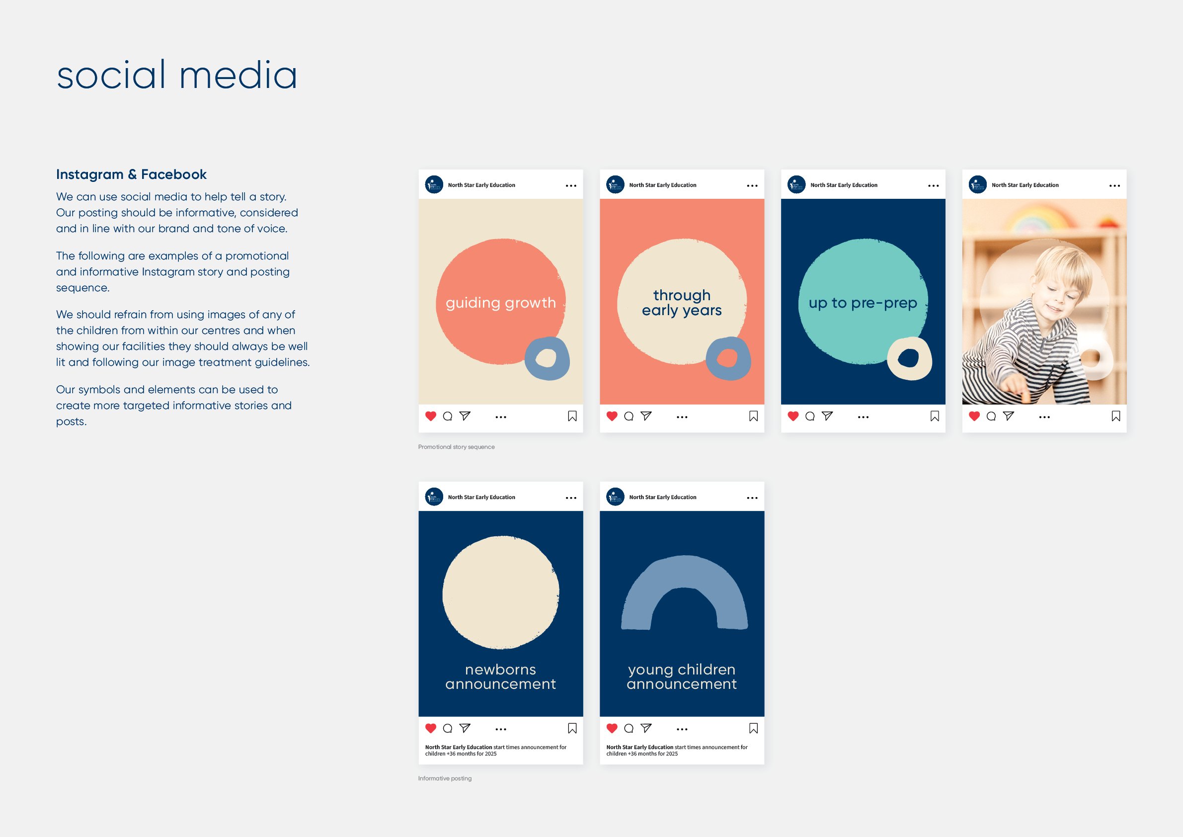
Tone of voice
Illustration design
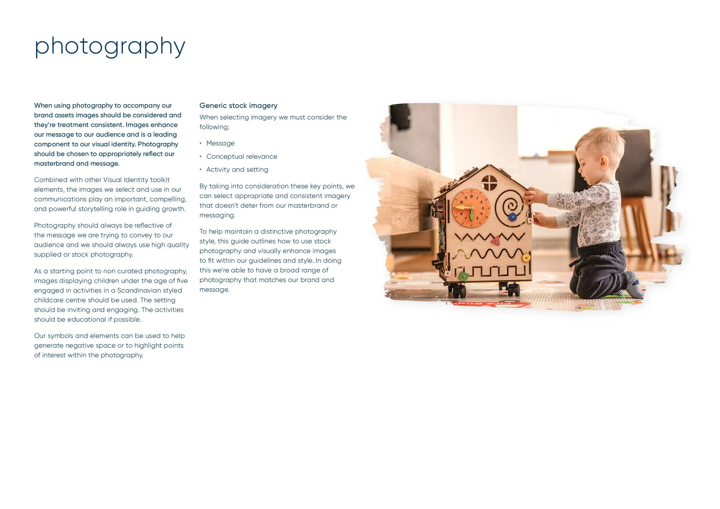
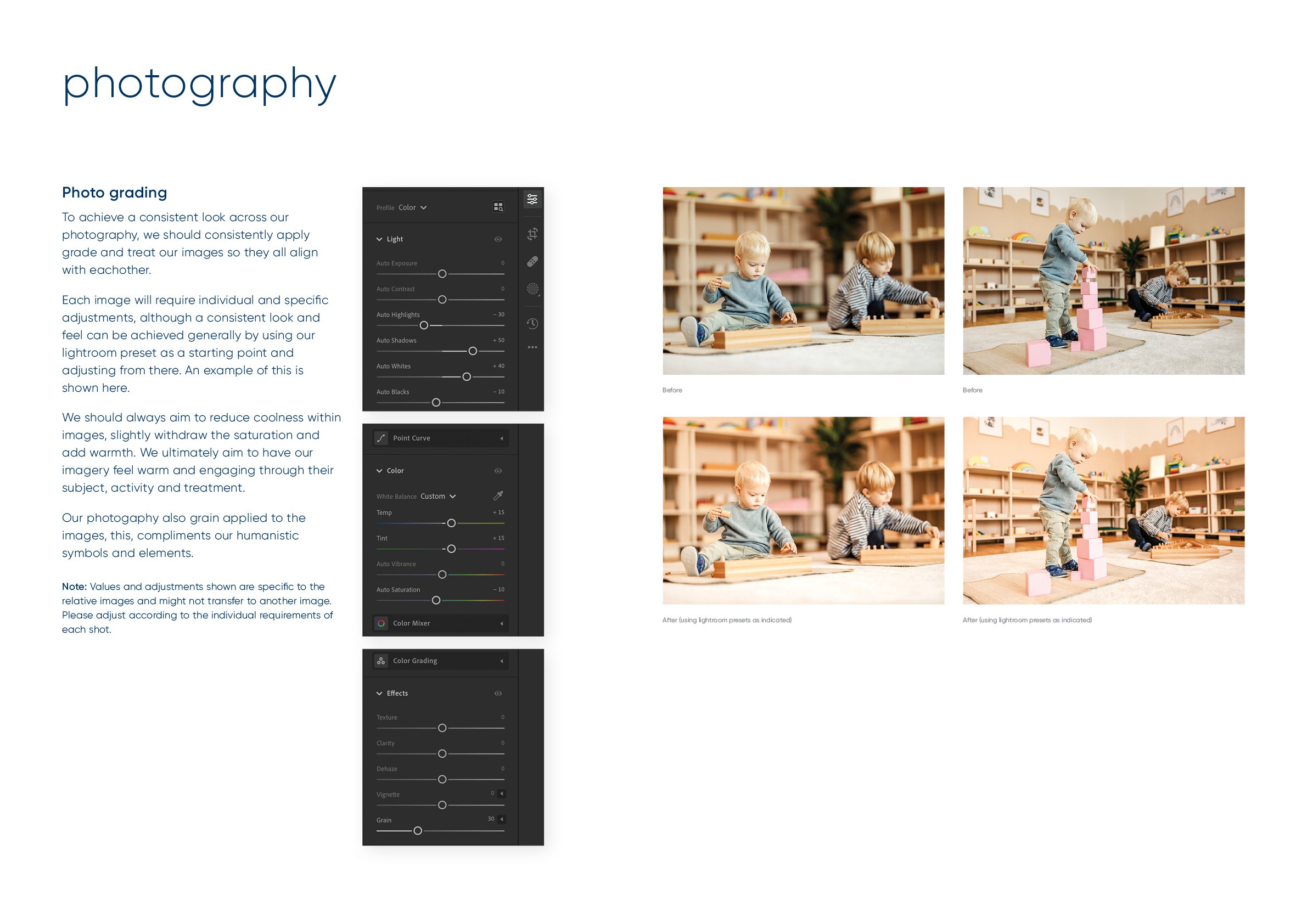
Photographic style
Logo and brand design
Visual identity design
Creative campaign


North Star Early Education seeks to bring world renowned Nordic childcare practices to the Australian market to elevate the childcare experience of children, parents and staff, and bring a ‘best in class’ ethos across the areas of curriculum, centre design and training. The brand is designed to create a sense of welcoming and engagement through teaching and learning.


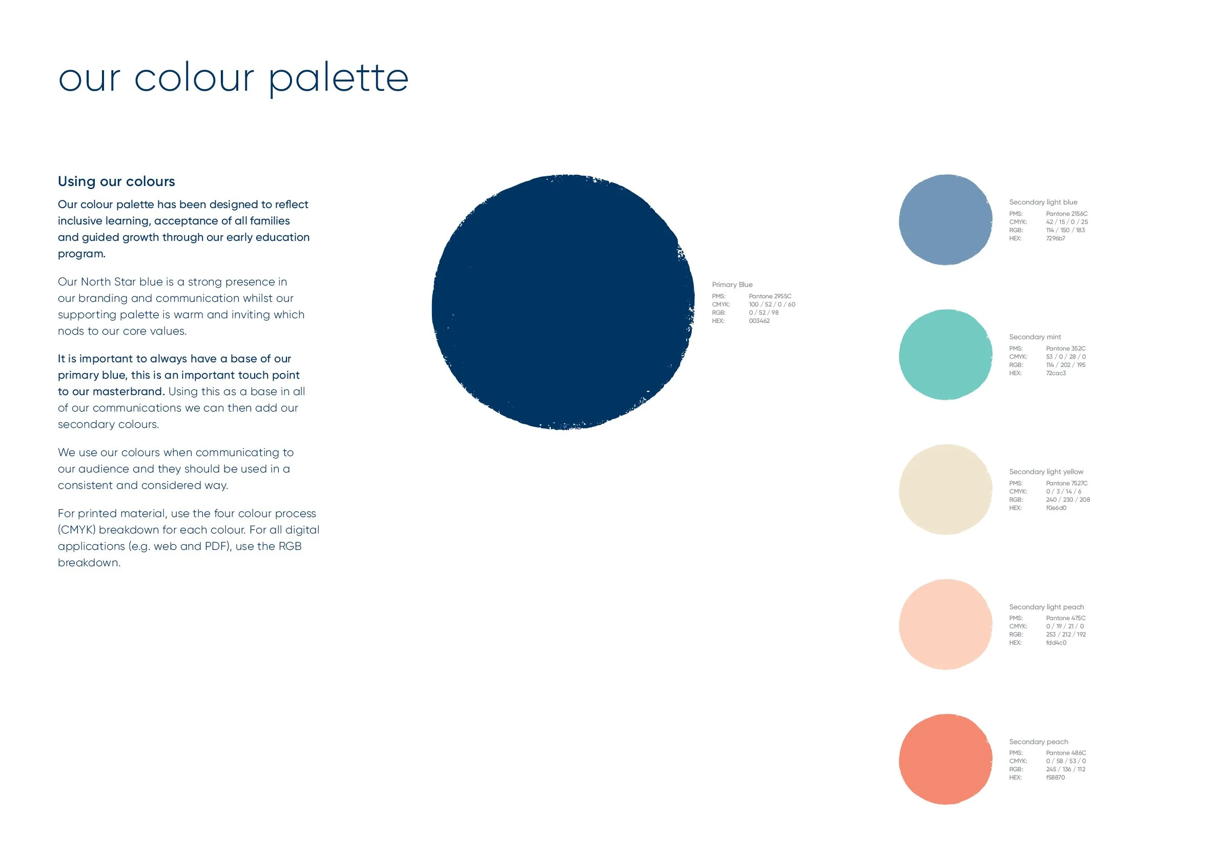
AVGD was approached to develop the logo and visual identity for the first Australian partner of Finland Way, the world leader in bringing Finland’s proven educational approach into a comprehensive franchise model, focusing on holistic development and joyful learning. The design brief highlighted the importance of using a guiding North Star, a humanistic style of iconography with a warm and approachable colour palette. There was consideration in the design process to create a flexible visual identity system which could be used across digital, print, signage and merchandise.


With a focus on engaging families looking for an offering that addresses all of their childcare needs we embarked on a collaborative design process with North Star Early Education. Research indicated the need to create centre’s that addressed the specific needs of families in the area such as; staff quality and attentiveness, communication and updates, centre design and feel, nutrition, outdoor and indoor activities, and contemporary learning opportunities for their child.

The North Star has been consciously designed to sit cohesively with each element of our brandmark, it leads the way. Ever present, the North Star is what we are reaching for.

The star icon has been designed as a progressive step forward from the existing Finland Way brands. The icon is humanistic and natural with a warm and approachable feel to the brand overall which resonates into our centres.

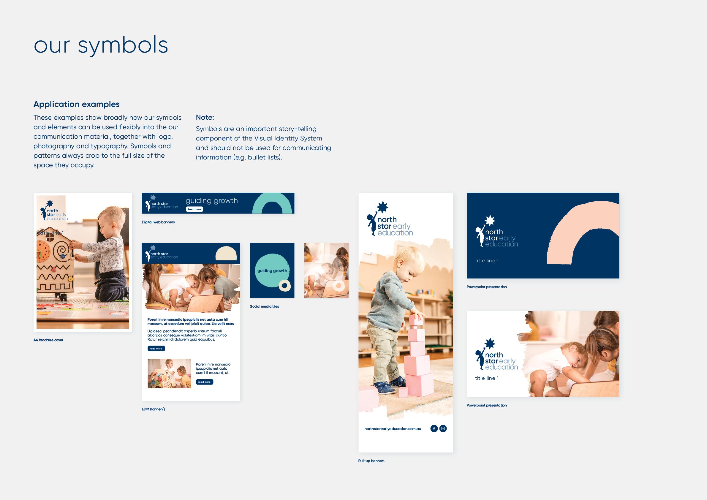
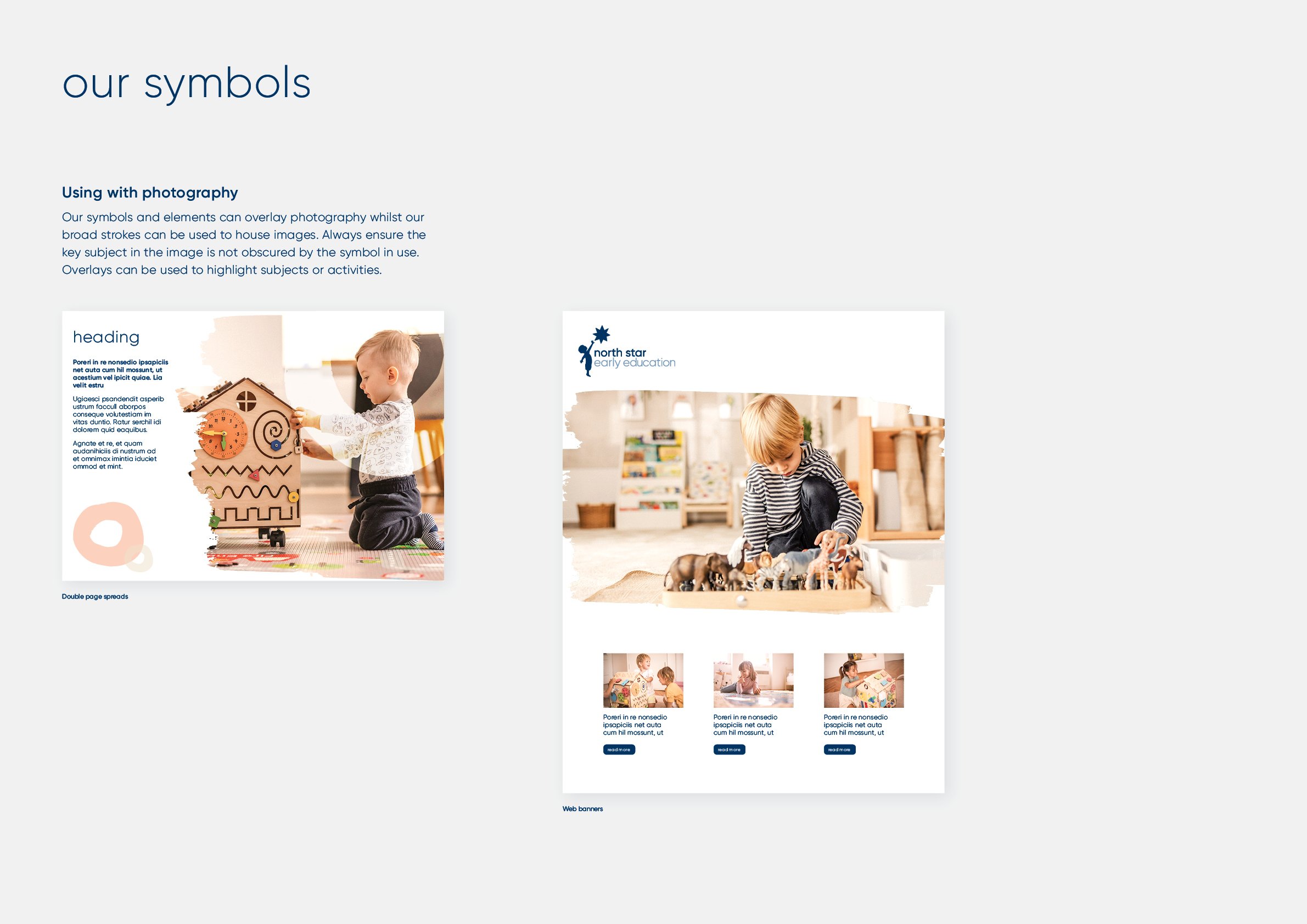
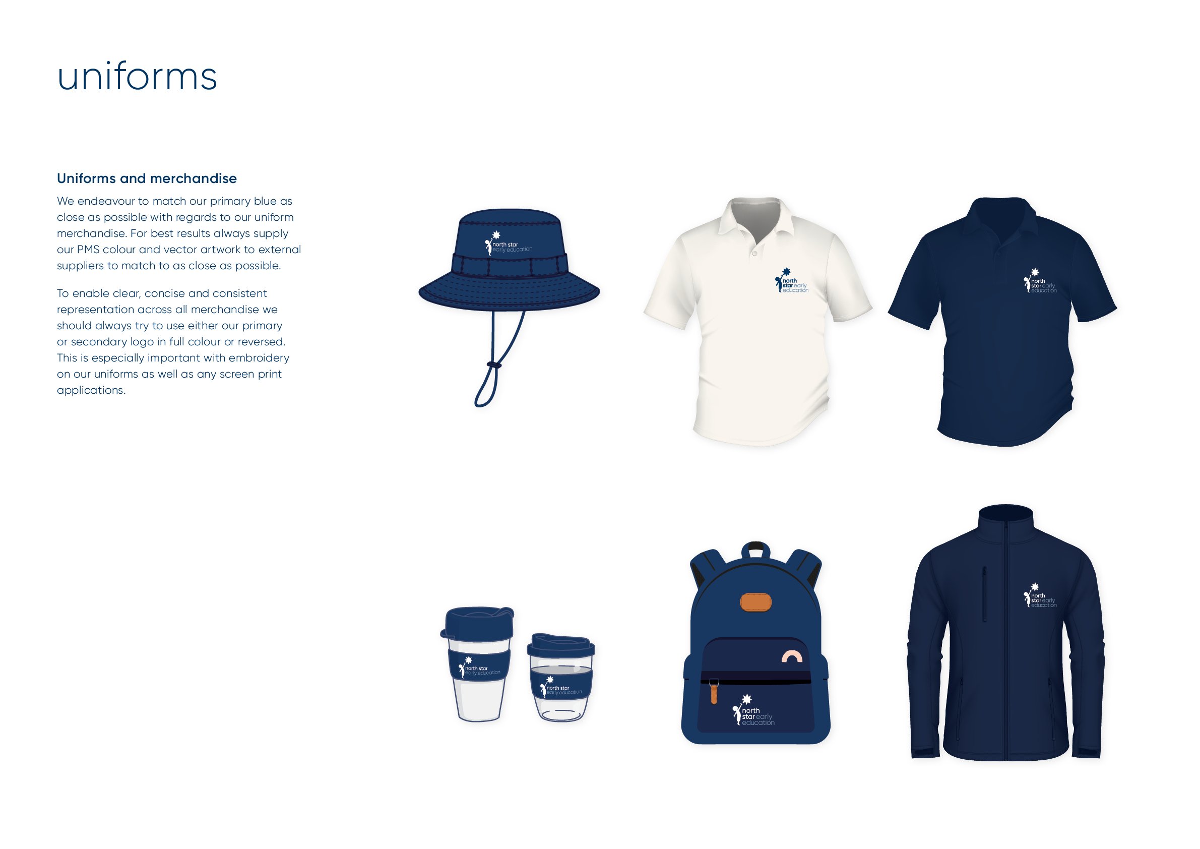
Shapes and symbols play a large role in the visual identity system. Four symbols were developed to identify the main age groups of our students. A suite of supporting graphic elements were designed to enhance the visual language. These symbols are humanistic in style with roughed edges and a hand drawn / scribbled feel to them.