University of Melbourne
Professional Development for Organisations
Print and digital
Typography
Infographics
Brand application
Publication Design
Concept development

Professional Development for Organisations (PDO) engaged AVGD to develop a clearer and more recognisable identity aligned with the University of Melbourne brand. The project focused on strengthening PDO’s position within the B2B education market while maintaining a strong connection to the University’s reputation and visual language.
To better understand market perceptions and identify growth opportunities, PDO engaged an external agency to research B2B decision-making and effective marketing strategies. The research explored:
How organisations select external training providers
Preferred marketing channels and trusted information sources
Reactions to the PDO brand name and narrative
A key finding was that the ‘Melbourne Professional Education’ name lacked clarity and was not clearly understood. Stakeholders indicated they would trust MPE more if it was explicitly linked to the University of Melbourne’s strong reputation. Following discussions and workshops, it was deemed that ‘Professional Development for Organisations’ as the clearest external facing text identifier for PDO’s B2B offer.
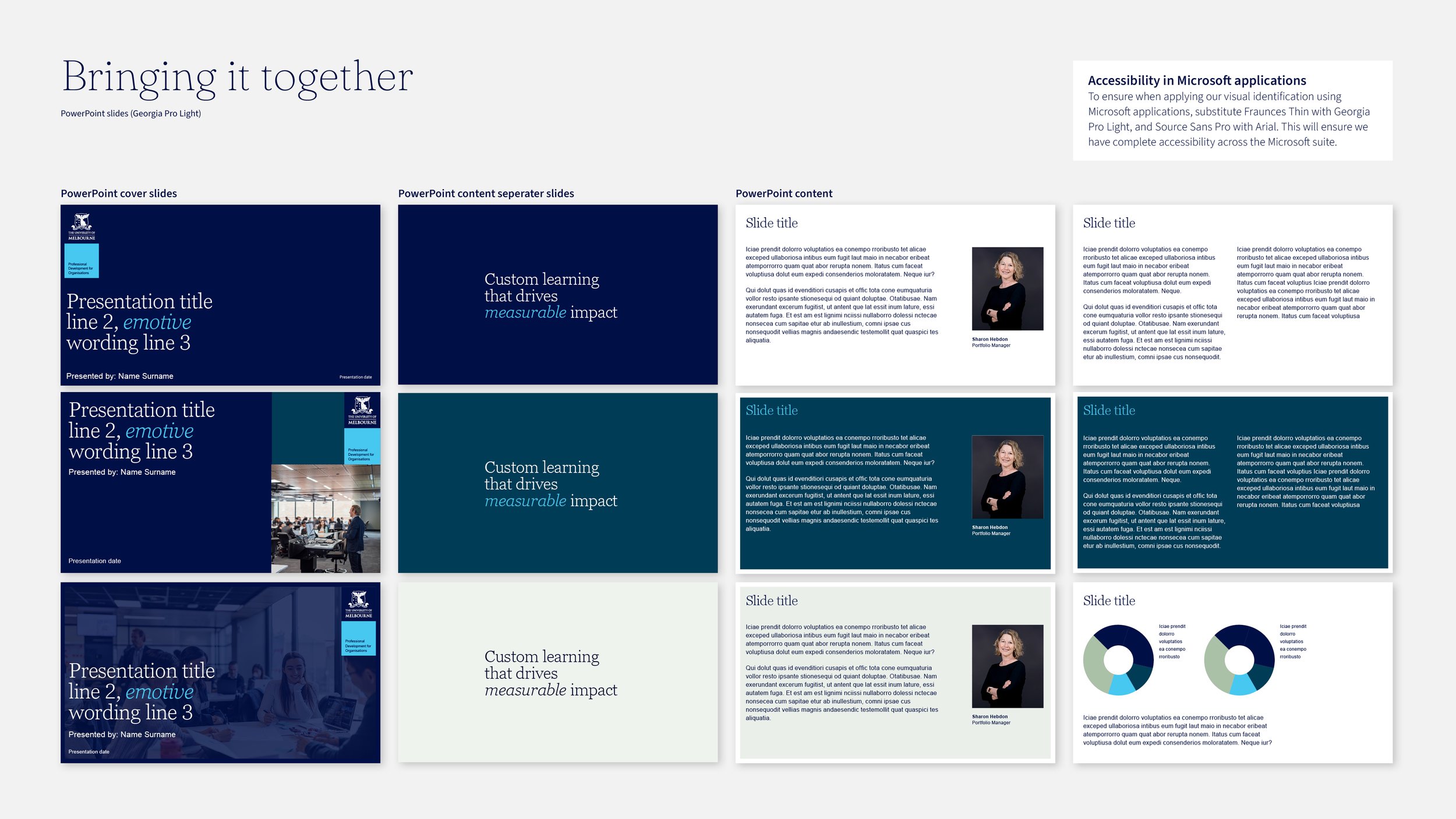
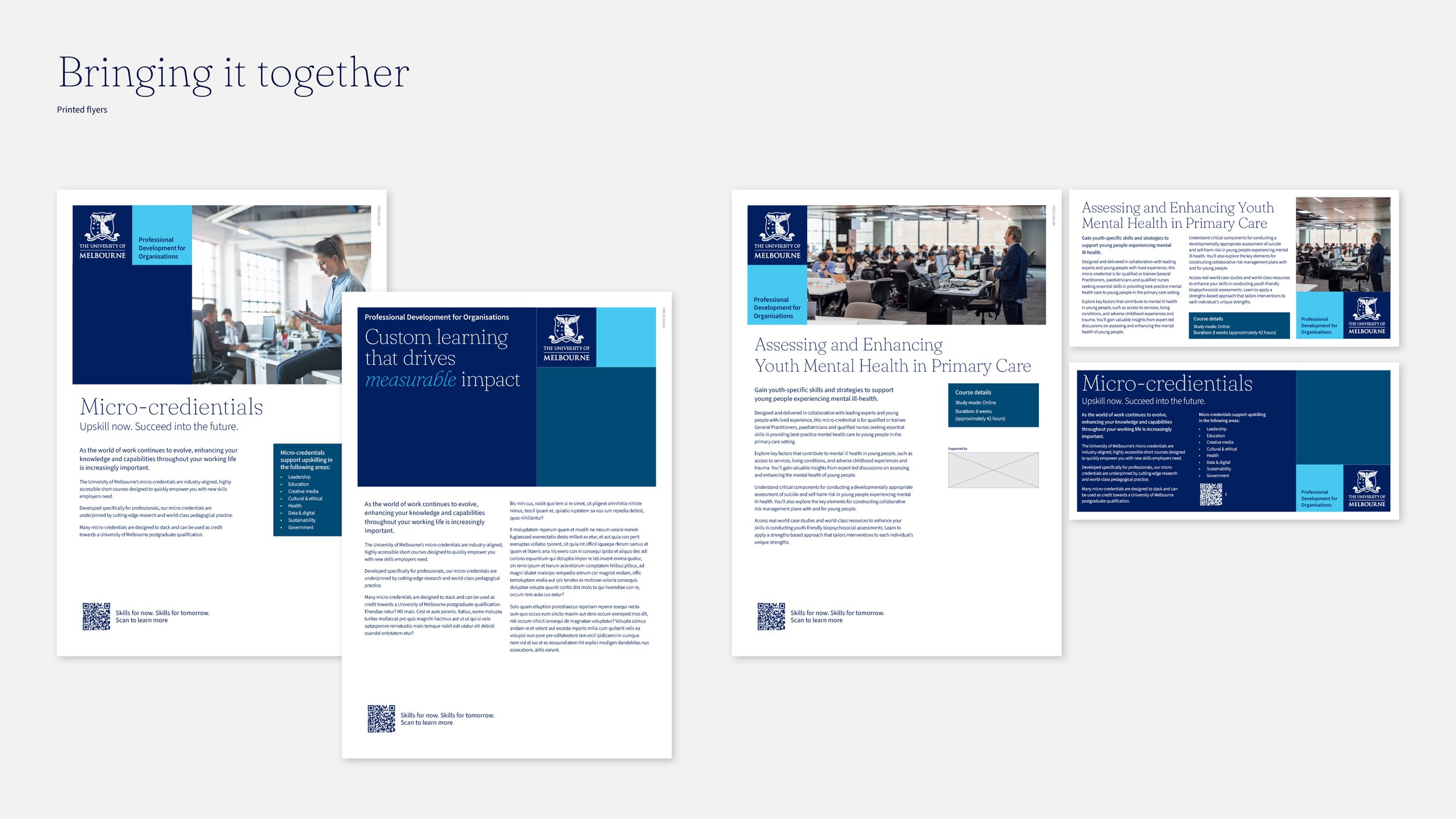
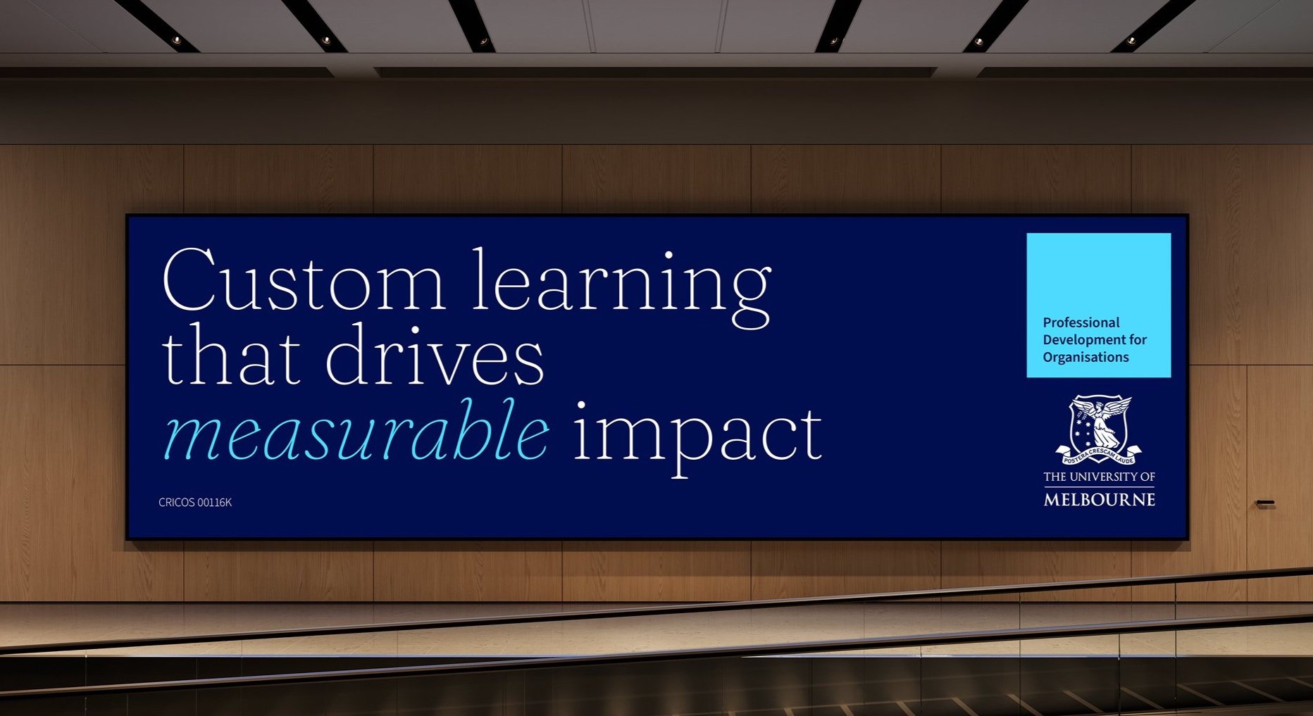
Working alongside the University’s internal brand team, we developed a flexible communication system spanning typography, colour application, campaign layouts and tone of voice across digital and print channels. Our design recommendation involved text identifyer application, colour pairings and usage guidelines, typographic style, photographic direction and communication tone of voice.
Success as defined by the client was, “to create a disctinct application of the University’s masterbrand visual identity that resonates with both internal and external audiences and crystallises who we are, what we do, and iseffective across our marketing mix and audience touch points.”


A brand toolkit was developed for Professional Development for Organisations, which indicates the key elements of their visual identity system.
Brand application should always use the University’s module as a guide for design. The brand-first, content-led approach can be used as a formulated guide on how to approach brand-first, content-led design. To reinforce the connection to the University, design elements and colour hierarchy are prioritised in the following order.
University of Melbourne Logo
Text identifier / CTA module (Kookaburra light)
Heritage blue module
Kookaburra dark with/without text module OR Image module
Image module OR Kookaburra dark with/without text module

The text identifier for Professional Development for Organisations can be applied as a flexible piece of content. It can appear beside or above the University logo or as content leading the massage. It is flexible and adaptable to suit channel an purpose, whilst visually represented in a consistent way.